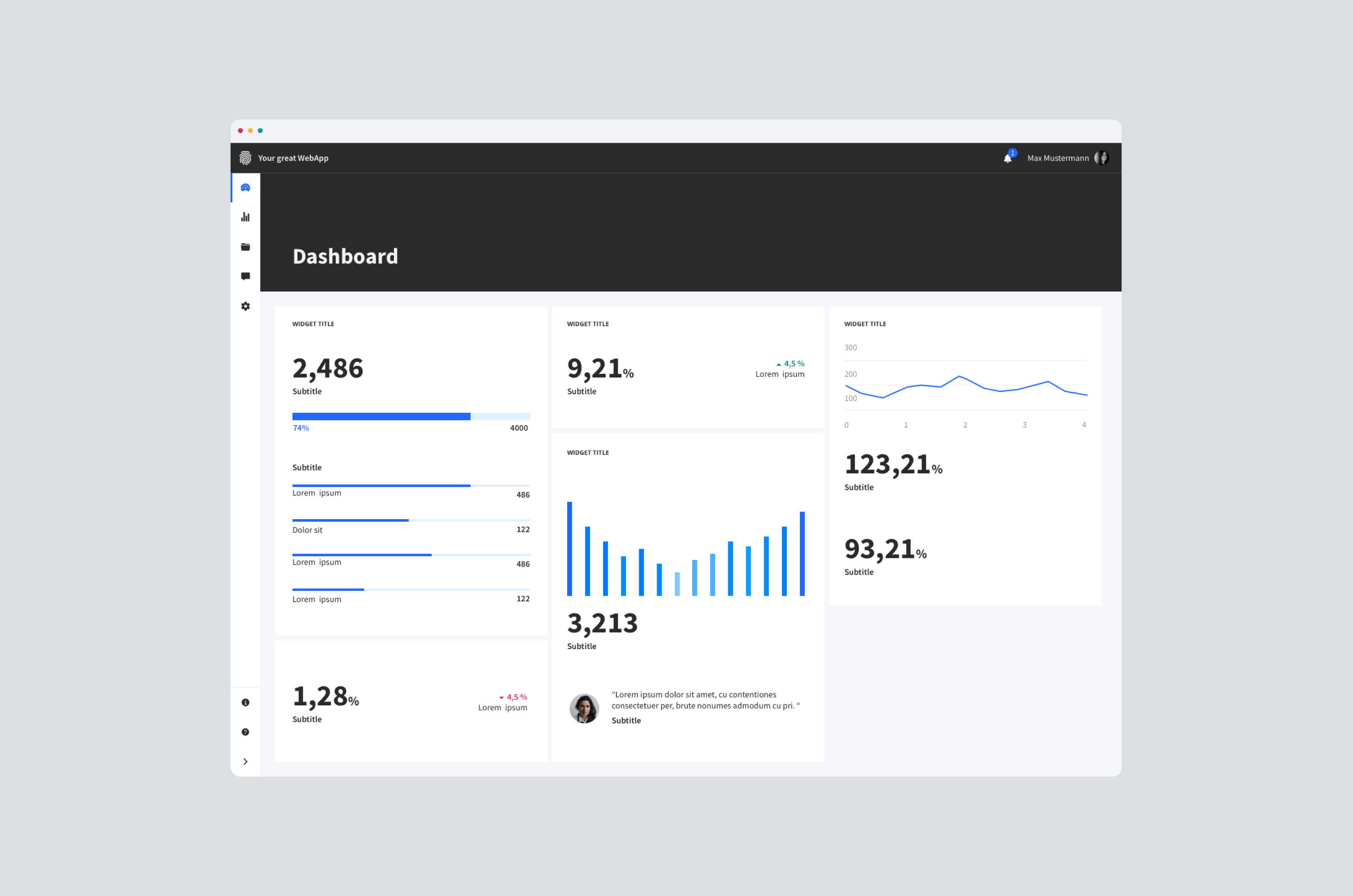
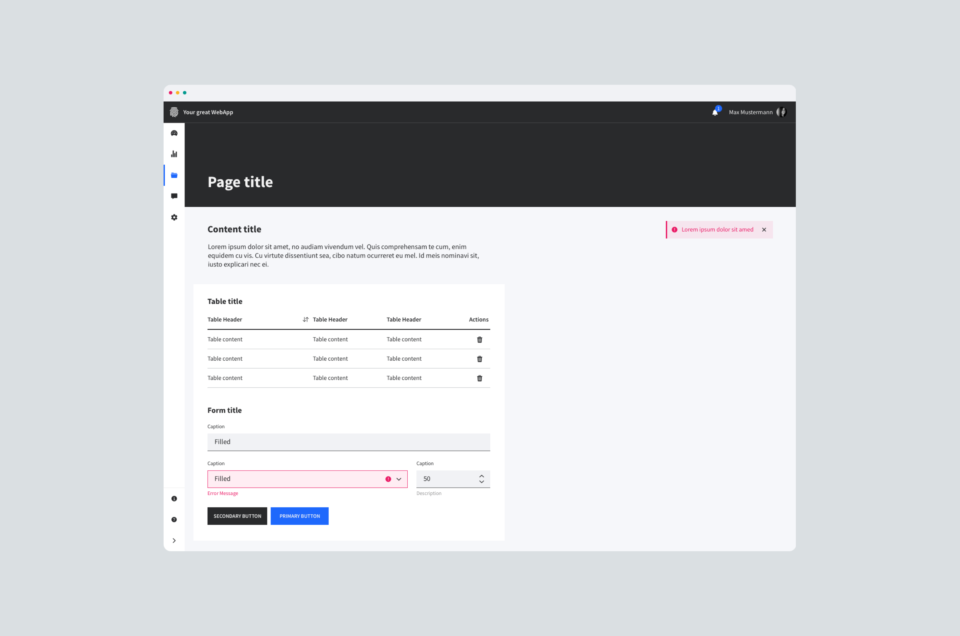
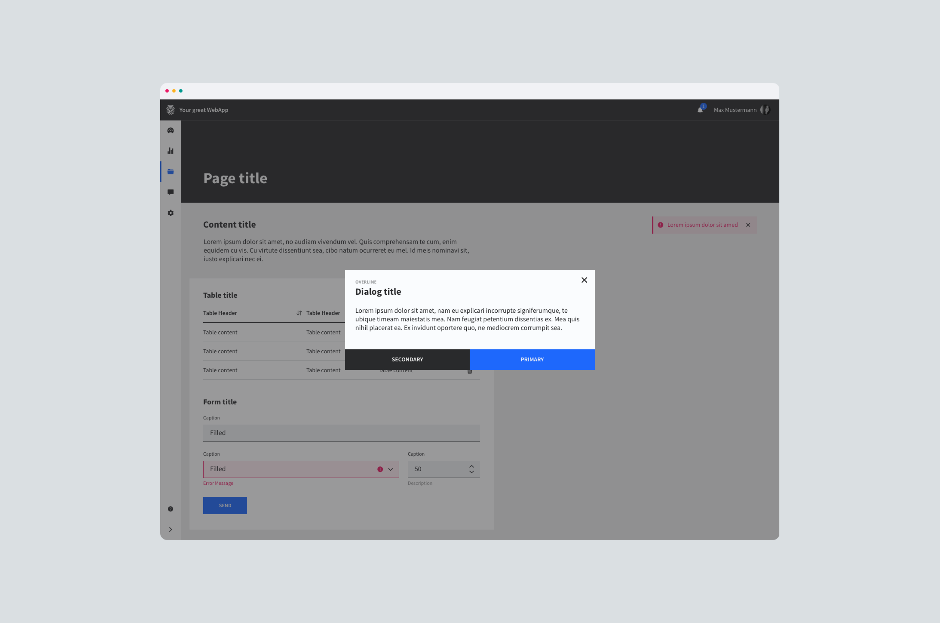
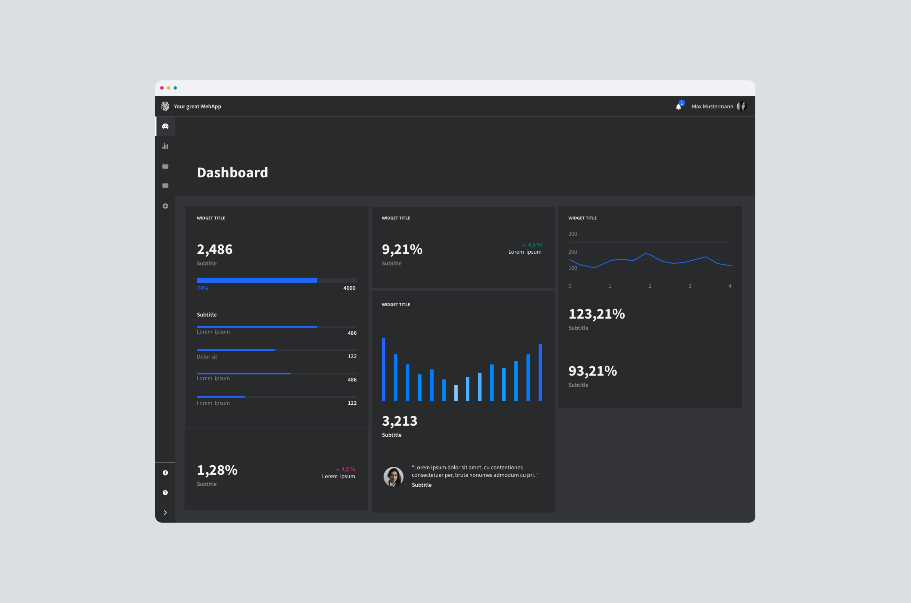
Plain Design System — UI Kit
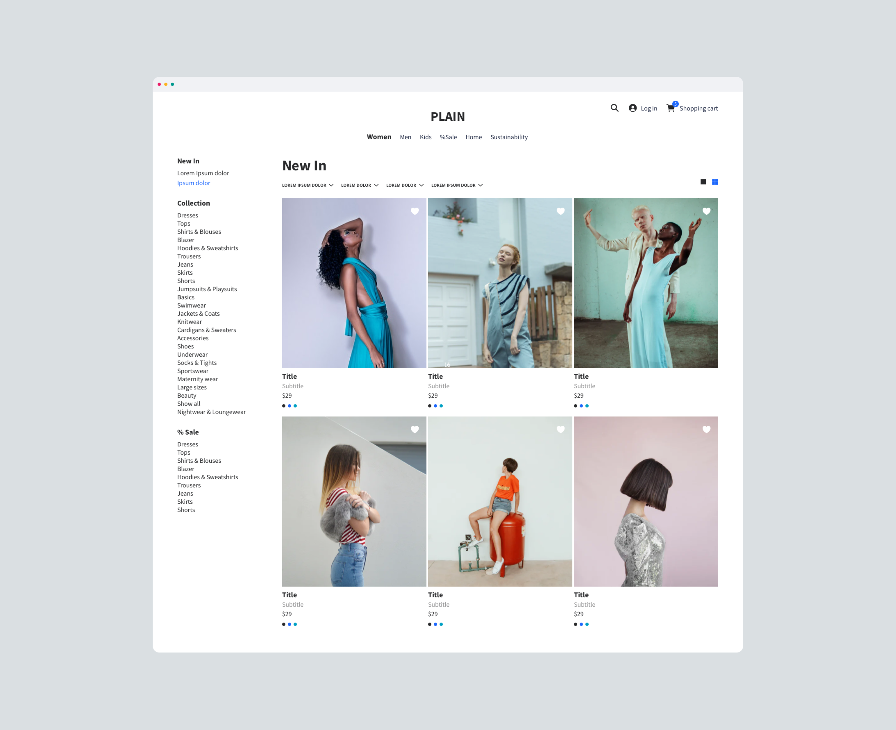
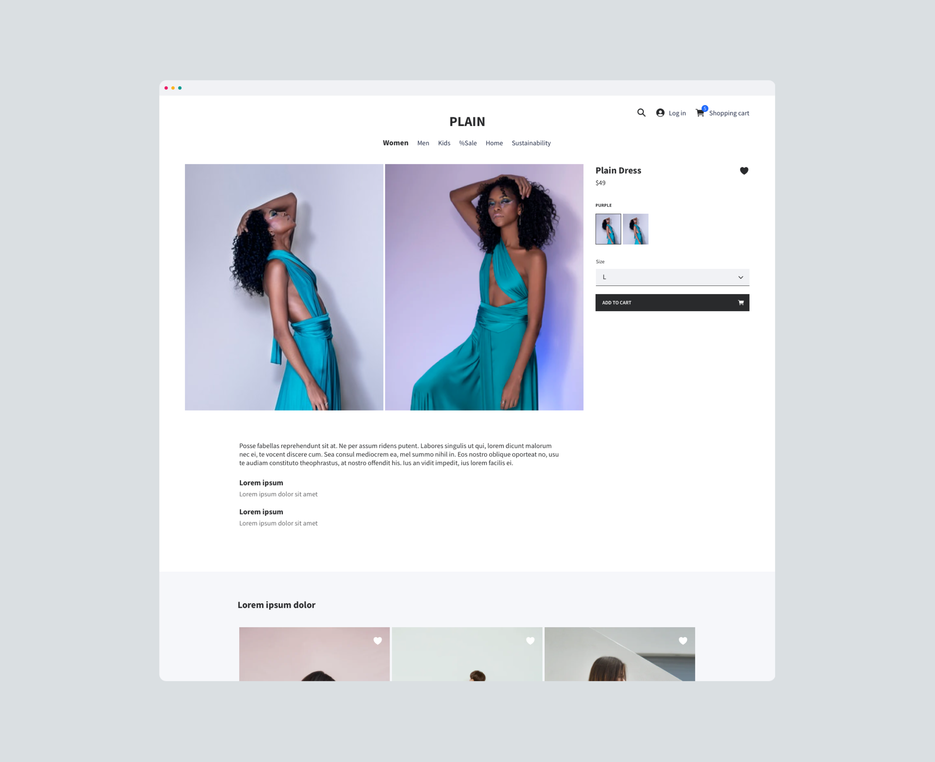
A minimal, functional and easy customizable component library for designing sophisticated digital products.
Description
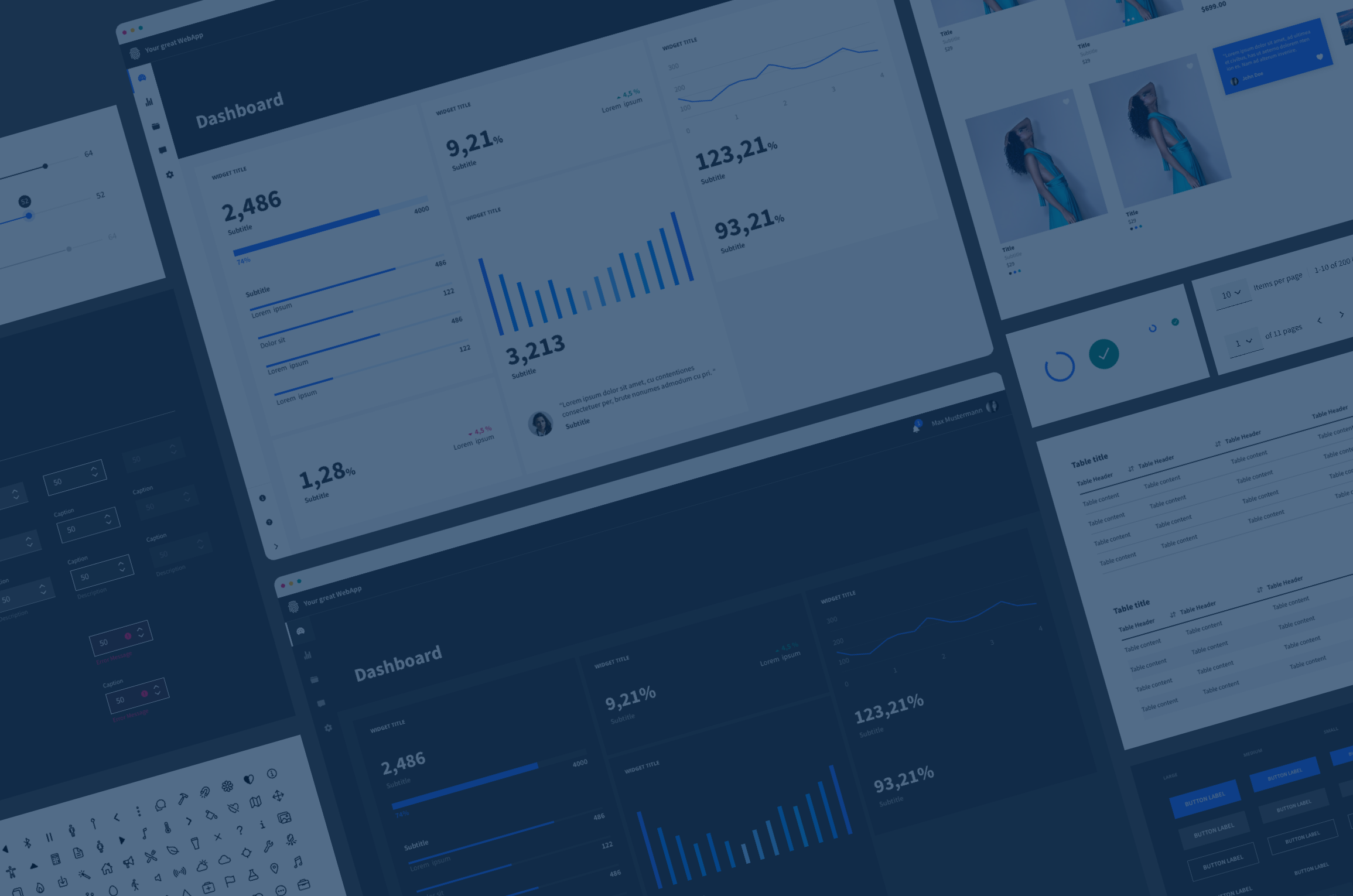
Streamlined and cost-effective design process. More than 780+ components will let you create more functional designs for each of your new products. Every color scheme comes with ten different color gradations. All color styles are easy customizable and linked to all components within the library.
The Plain Design System UI Kit is working great together with the Ionicons icon set. It's an open-sourced icon set with 1,200+ icons crafted for web, iOS, Android, and desktop apps.
Supercharge your design workflow with Plain.
Compatibility
Compatible from Sketch 70.2
Purchase
100s of ready-to-use responsive components
Streamlined and cost-effective design process. More than 780+ components will let you create more functional designs for each of your new products.
Need support?
If you have any questions, comments or improvements, don't hesitate to contact me.
Let's design and create sustainable and human-centric products together.
